如何使用wps表格制作双轴坐标图
如何使用wps表格制作双轴坐标图?wps表格是一个办公软件,相信很多小伙伴都使用过。想要使用wps表格制作双轴坐标图,具体该怎么制作?下面就是使用wps表格制作双轴坐标图的方法,一起来看一下。
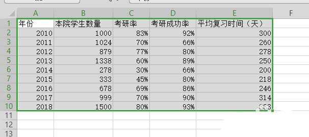
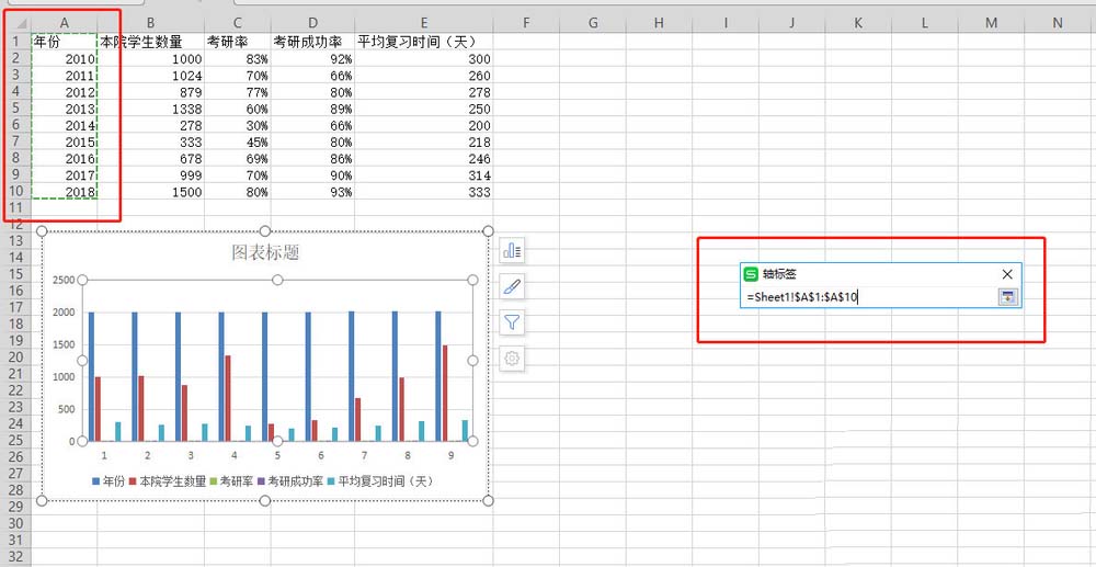
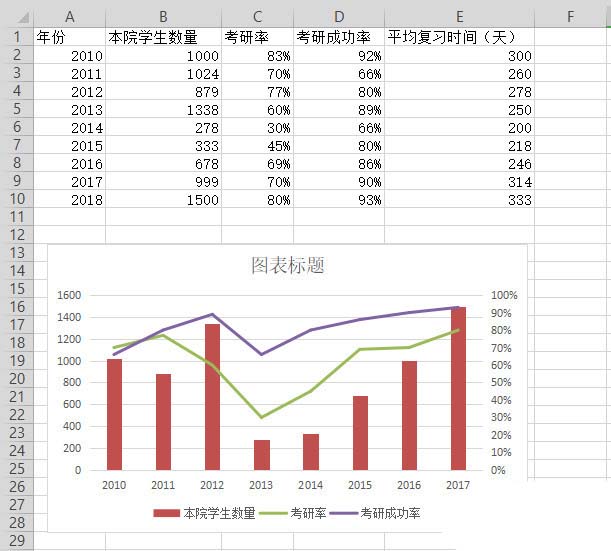
1、打开测试数据,之后,选中测试数据

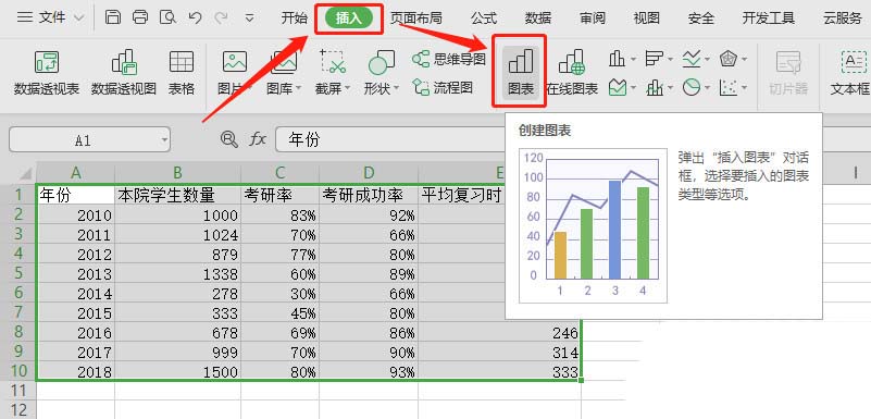
2、插入 -> 图表 -> 稍后,直接点击确定即可
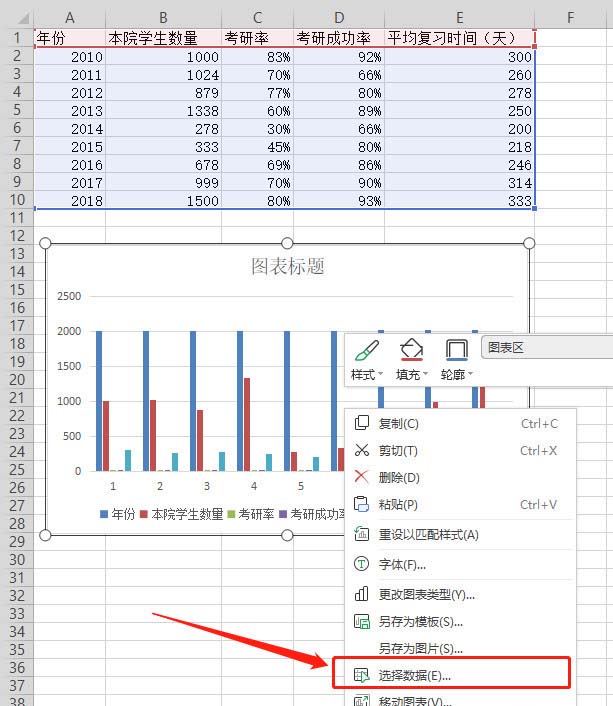
3、此时,生成的图表是不符合要求的。需要额外编辑,在生成的图表上右键 -> 选择数据

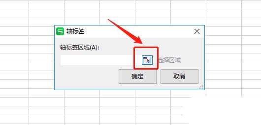
4、我们希望使用年份作为类别,但是通过打开的对话框可以发现,因为样例数据的格式特殊,年份也被作为了系列看待。因此,点击图中按钮,我们手动选择类别,具体操作见下一步骤
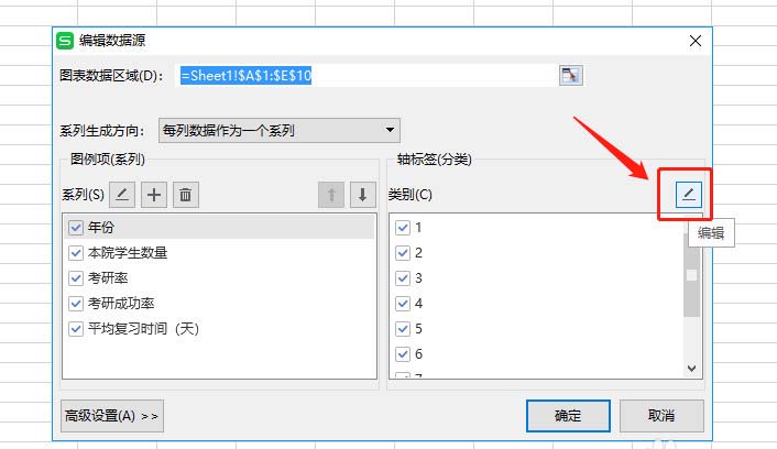
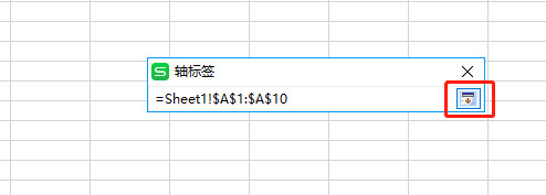
5、点击上一个步骤中提到的按钮后,可以看到轴标签的对话框。可以手动在输入框编辑,也可以去选中,我们点击图中按钮,选中数据区域。之后,轴标签输入框会自动填充我们选中的区域。点击右侧按钮,确认后,再点击确定即可。
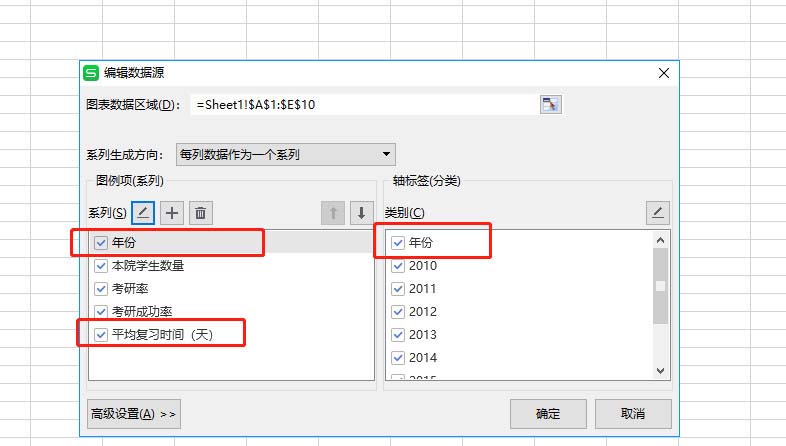
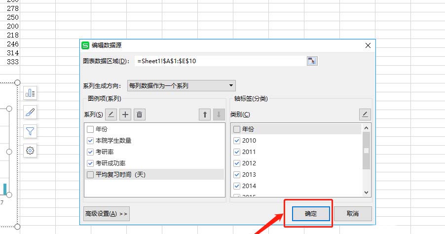
6、系列:年份、平均复习时间(天)这两项不需要,去掉勾选;
类别:年份不需要,去掉勾选;点击确定。
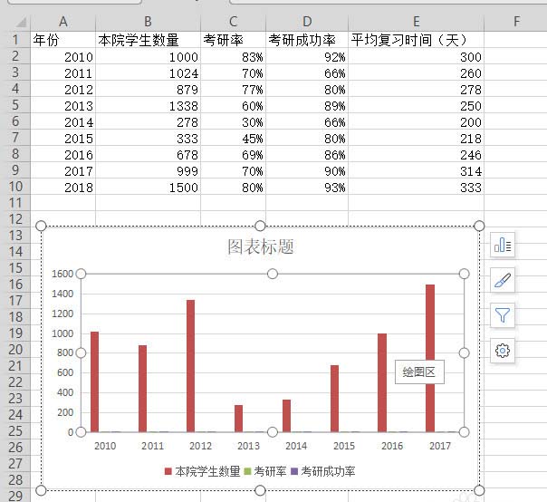
7、此时,看到一个大致符合要求的柱状图。只是,考研率和考研成功率完全看不清呀,原因自然是相较于人数,百分比的值太小了。此时,就该我们的双轴坐标图登场了!
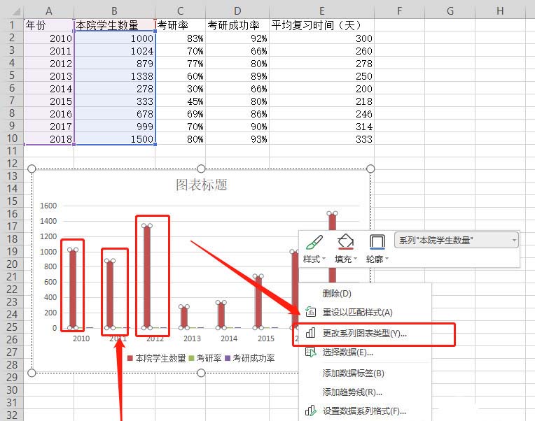
8、在图表上任意选中一个系列的元素(要选中呦)。之后,右键 -> 更改系列图表类型,在出现的组合图对话框,就可以对每个系列的展现形式进行编辑。将百分比的两个系列修改为折线图,并勾选次坐标轴,之后确定。
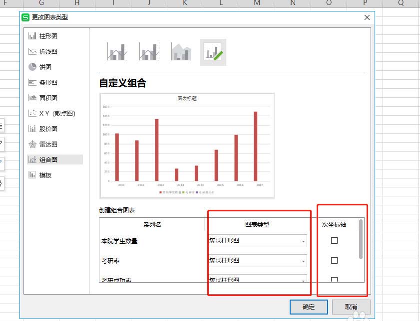
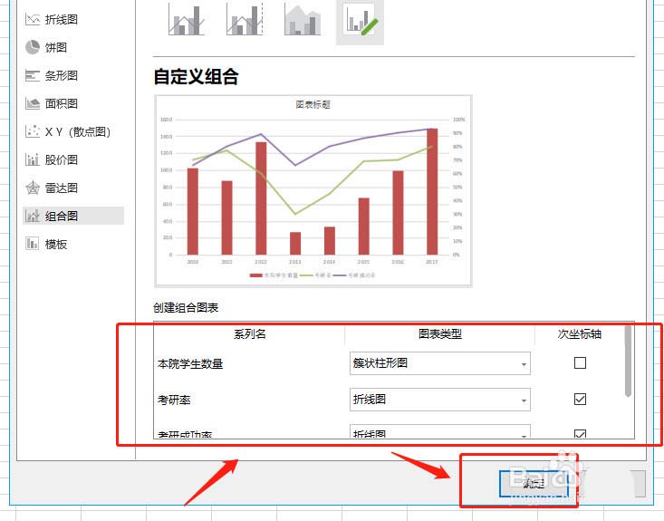
9、就得到了一个展现形式更优雅的图表啦,左边的纵坐标是人数,右边的纵坐标则是百分比。双轴,也即如此这般两个坐标轴的含义。
上面就是使用wps表格制作双轴坐标图的方法,大家学会了吗?更多相关教程,请继续关注系统之家。